|
|
The Mollier diagram and the Psychrometric Chart |
If you think that the slightly skew edges of your Mollier or Psychrometric Diagram are the result of multiple passes of the image through bad copier optics, then this article is for you.
One can make a reasonable career in preventive conservation, and carve out a position of influence and power, through understanding this one diagram. It describes all the properties of moist air that the conservator needs to know. A thorough understanding of how the diagram is constructed is a great help in using it, particularly when exploring thermal properties of moist air.
The Mollier Diagram is the European version of the Anglo-American Psychrometric Chart. They are identical in content but not in appearance. I will describe first the Mollier diagram and then show the simple transformation that changes it into the psychrometric chart.
The Mollier diagram, also called the ix diagram, is based on the relationship between heat content and water vapour content of air. The heat, or energy, content is difficult to measure directly, so the diagram is cunningly distorted to give the illusion of being based on the relationship between temperature and relative humidity and water vapour content. Temperature is easy to measure, relative humidity is considered by some people to be easy to measure and so the diagram is transformed into a useful tool.
Heat content is called enthalpy in the jargon of the air conditioning engineer, so I will use this word from now on. It is measured in Joules.
By convention, the enthalpies of both water and dry air are defined to be zero at zero degrees Celsius. To obtain the enthalpy of moist air at any temperature we need to calculate three quantities: how much heat needs to be used to vapourise the water, how much heat is needed to warm the water vapour to the required air temperature and how much heat must be added to the other, constant components of the air, mostly nitrogen and oxygen.
It is helpful to start by getting a sense of the magnitude of these quantities by calculating an example, before looking at the diagrammatic representation which generalises them.
Consider one cubic metre of air at 10C and 40% RH. It weighs about 1 kg. The water content is about 0.003 kg per kg of dry air. Just evaporating the water takes 0.003 x 2501 (the latent heat of vapourisation of water in kJ/kg) = 7.5 kilojoules of energy, without raising the temperature above zero. Raising the temperature of this steam by ten degrees requires 10 x 0.003 x 1.84 (the specific heat of steam) = 0.06 kJ, not very much compared with the heat needed to vapourise the water. Finally the nitrogen and oxygen take 10 x 1 (the weight of the air) x 1.007 (the specific heat of air) = 10.1 kJ.
Heating the air is the largest of the three energy inputs that are needed. Notice, however, that the energy needed just to vapourise the necessary water into the air to give 40%RH is of similar magnitude to the energy needed to heat the air from zero to ten degrees. This is why humidification is expensive.
This calculation can be generalised in a diagram showing lines of constant temperature plotted on a grid with enthalpy, i, on the vertical axis and water vapour content, x, on the horizontal axis:
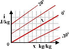
Consider first the bold red line marked 0 (degrees C.). The slope upwards to the right indicates that energy is needed just to add water vapour to the air at constant temperature. The line for 20 degrees starts higher up the energy axis, i, because energy is needed to raise the temperature of dry air. The line then rises diagonally with increasing water content, nearly parallel to the isotherm for zero degrees, but with a slightly greater upward slope. This divergence is because the energy needed to heat the water vapour component of the air is greater than that for dry air: the specific heat of dry air is about 1 kilojoule per kilogram per degree while the value for water vapour is 1.84 kJ/(kg.K). This is a large difference but because air at 10C and 40%RH contains very little water vapour, the increase in slope is quite small in the region of the diagram that is of interest in conservation.
This then is the basic diagram linking enthalpy, water content and temperature. Now we come to the elegant transformation that makes it much more useful and versatile.
The red isotherms linking points of equal temperature on the diagram are so nearly parallel in the region of interest in air conditioning and outdoor climate that the diagram can be sheared by holding steady on the left side and pulling down on the right edge until the line for zero degrees lies exactly horizontal, whereupon the other isotherms lie very nearly horizontal.
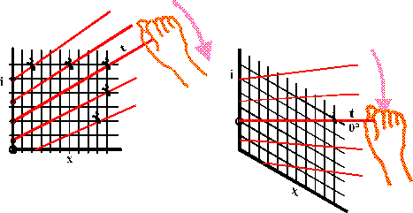
Imagine the entire diagram made of wires that are hinged together to form a net that can be sheared by grasping the zero isotherm and forcing it down to a horizontal position. The other isotherms will now be almost horizontal, giving a vertical axis that is both temperature, reading horizontally across, and enthalpy, reading diagonally across and down.
We now have the skeleton of the Mollier Diagram.
(Page revised 2010-06-18)

This work is licensed under a Creative Commons Attribution-Noncommercial-No Derivative Works 3.0 License.