|
|
Handling data from loggers |
Some data loggers have mysterious output formats. Nearly all, however, come with software that can translate the data into ASCII code, in which decimal numbers are separated by commas and data for each measuring time is separated by a new line character. If the data logger software won't export an ascii file, don't buy it. You will lose a lot of flexibility in interpretation and report presentation.
Some loggers make separate data files for each sensor, so that temperature is separated from its corresponding RH value. This makes calculation difficult by requiring an extra process of fusing the two data sets.
For serious interpretation you will need a spreadsheet or scientific graphing program. Most people use Microsoft Excel.
Spreadsheets are not well suited to manipulating climate data. The program designer expects you to want to make relationships in diagonal directions over the spreadsheet. Weather measurements are basically a long database of numbers, where diagonal relationships in the table are irrelevant. There are, however, several freeware, and shareware graphing programs that cope with very large sets of numbers. I favour the specialised graphing program 'gnuplot', whose use is described by an example on the next page.
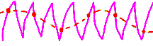 On the subject of data points there is one peculiar hazard of interpreting the intermittent data that comes from digital data loggers, in comparison with the continuous trace from the thermohygrograph. It is possible to get quite wrong graphs in air conditioned rooms. Most air conditioners switch between heating and cooling and wetting and drying, at set points. The continuous graph looks like the purple zigzag. The frequency is not constant: it varies with the heating and moisture load. A data logger which just wakes up once an hour to squint at the weather and note the instantaneous value will give a quite different curve: the dotted orange line.
Some data loggers can be told to measure more frequently and then average the result before memorising it. This also can give misleading curves by smoothing out variations that are often useful in diagnosis.
Translating the values for RH and T into dew point or vapour pressure will reveal if the inside air is just outside air warmed up, or cooled. Any excess of water indicates rising damp, leaky walls or roof, a simmering coffee maker, or lots of people. The way in which the water vapour content of the inside air follows that outside gives an indication of the leakage rate, complicated by the moisture buffering capacity of the building. Most buildings are comprehensively smeared with plastic paint so there won't be much buffering.
The various formulæ for playing around with units of atmospheric moisture are listed in another chapter. The java script of the calculator, has the formulae in a format close to that required by a spreadsheet. You can download this file and then call it from your own computer without connecting to internet every time.
One can certainly print everything out and stuff it in a box in direct continuation of thermohygrographic tradition but one then loses the main advantage of digital methods: the ability to compare and contrast, to join records to show years at a time. The most reliable archiving method at present seems to be to collect a few of months data on disk and then burn it onto a CD-ROM disk. Other mass storage devices have arcane formats that will probably become obsolete more quickly. The next problem is how to conserve the CD. There are clever people working on that one.
References
Appendix: gnuplot

This work is licensed under a Creative Commons Attribution-Noncommercial-No Derivative Works 3.0 License.